
About Platfora
Platfora was a Big Data Discovery platform built natively on Apache Hadoop and Spark. Platfora enabled users to visually interact with petabyte-scale data in seconds. Data sources from hadoop, cloud, traditional databases went through data prep powered by platfora lenses and got translated to data products like platfora vizboards.
Platfora aligned scrum teams to feature deliverables. I was responsible for UX in following features: Behavioral Analytics, Vizboards, BI, etc.


Overview
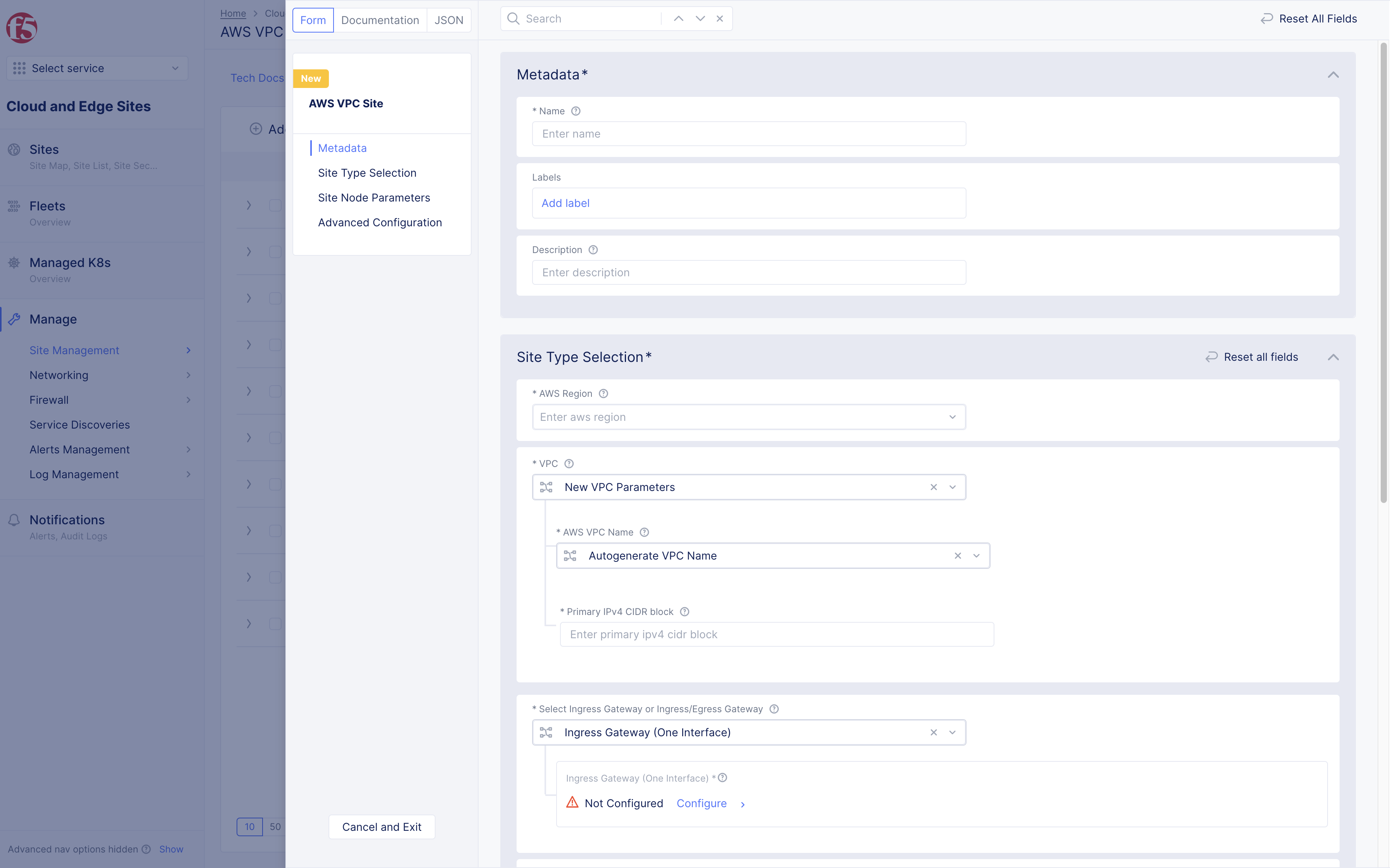
Form and Wizard
When users are trying to configure an object (site, policy, network, etc) or other settings (user, role, billing, etc) there are two ways to do it. Initially we designed a modal form. This worked well for simple set-ups where users had to only fill in a few input fields and select options.
However, we had a complex configuration that modal form couldn’t support. This is why we created wizard, which provides step-by-step guide, easier navigation, better hierarchical view, and more detailed information.


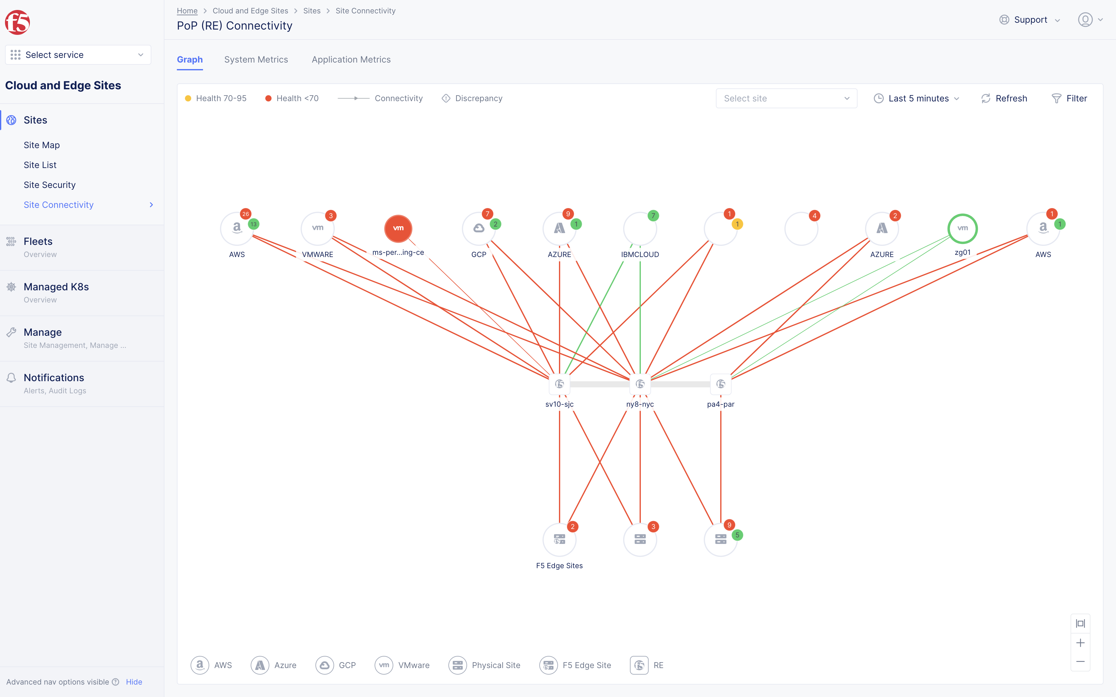
Graph
Once users finish the configuration part, now they can monitor how objects are performing. The issue: hundreds of objects waiting to be monitored. (sites, site-to-site traffic, apps, app-to-app traffic, networks, etc)
Where would users start? Graph is one solution we developed to resolve this issue, especially for its' birds-eye view, which helps users quickly find alerting sites, apps, and networks. Graph lets users drill down into a problematic cluster.


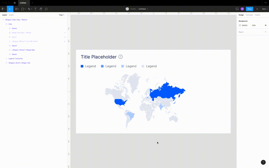
Map
Map provides another good place for users to start as it shows all nodes in one view. You can see below how users can zoom in/out and search. For users interested in geospatial information, map is the best choice.
Then, is map better than graph?
Unlike graph, map doesn't support hierarchical structure and is ill suited for showing connection lines. One is not superior to another. It all depends on what type of information the user is looking for.

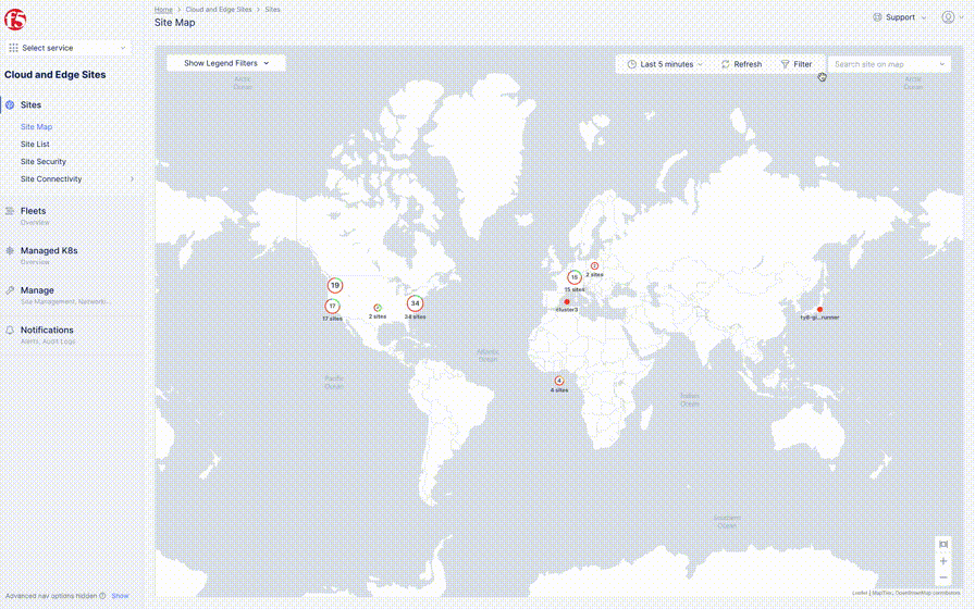
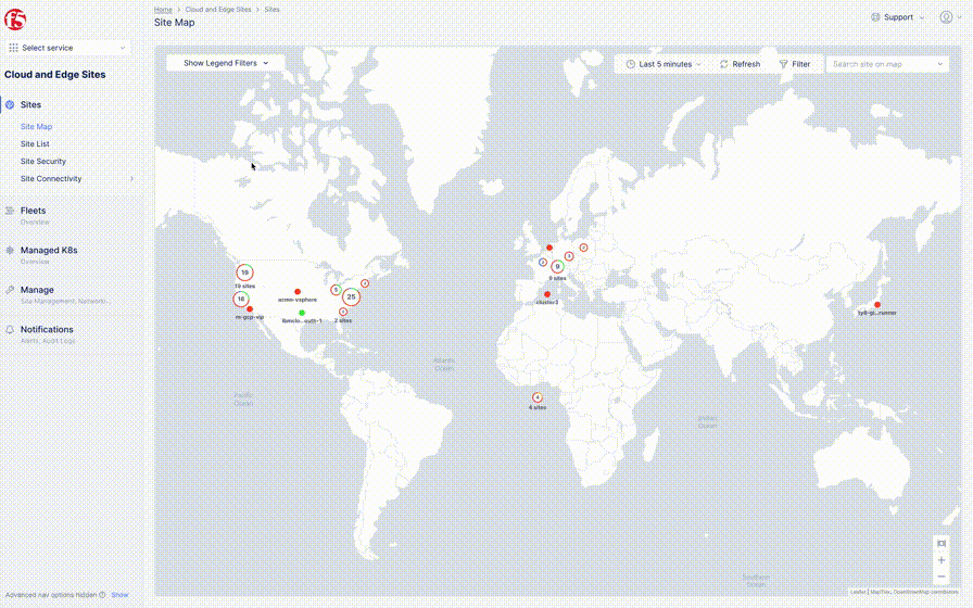
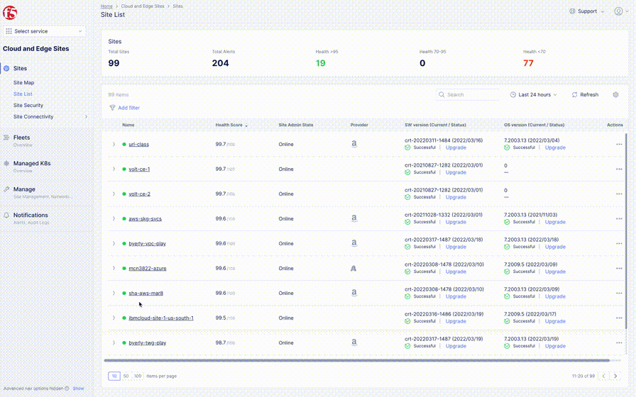
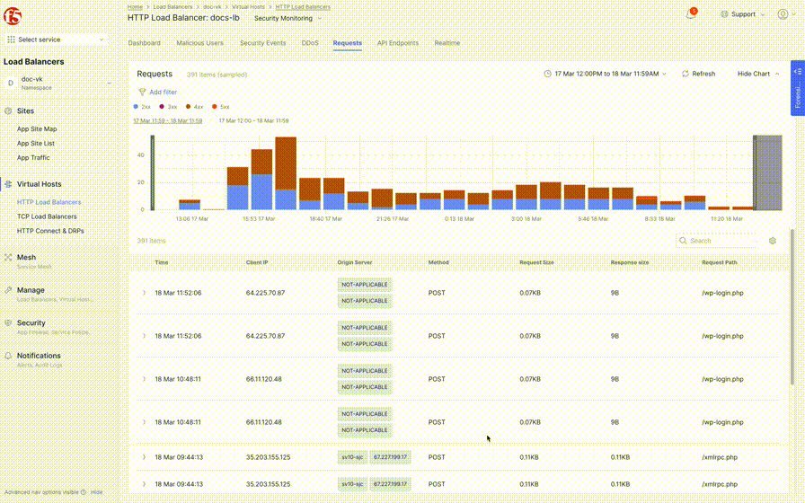
Table & Overview tile
Table and Overview tile are other entry points users can take. Unlike graph and map (which mostly use color to show status) Table and Overview tile show text heavy information (e.g. latency, request/response rate, error rate) great for users seeking specific metric or sorting of metrics.
The downside?
Table nor tile can't show all objects in a single view, like graph or map.


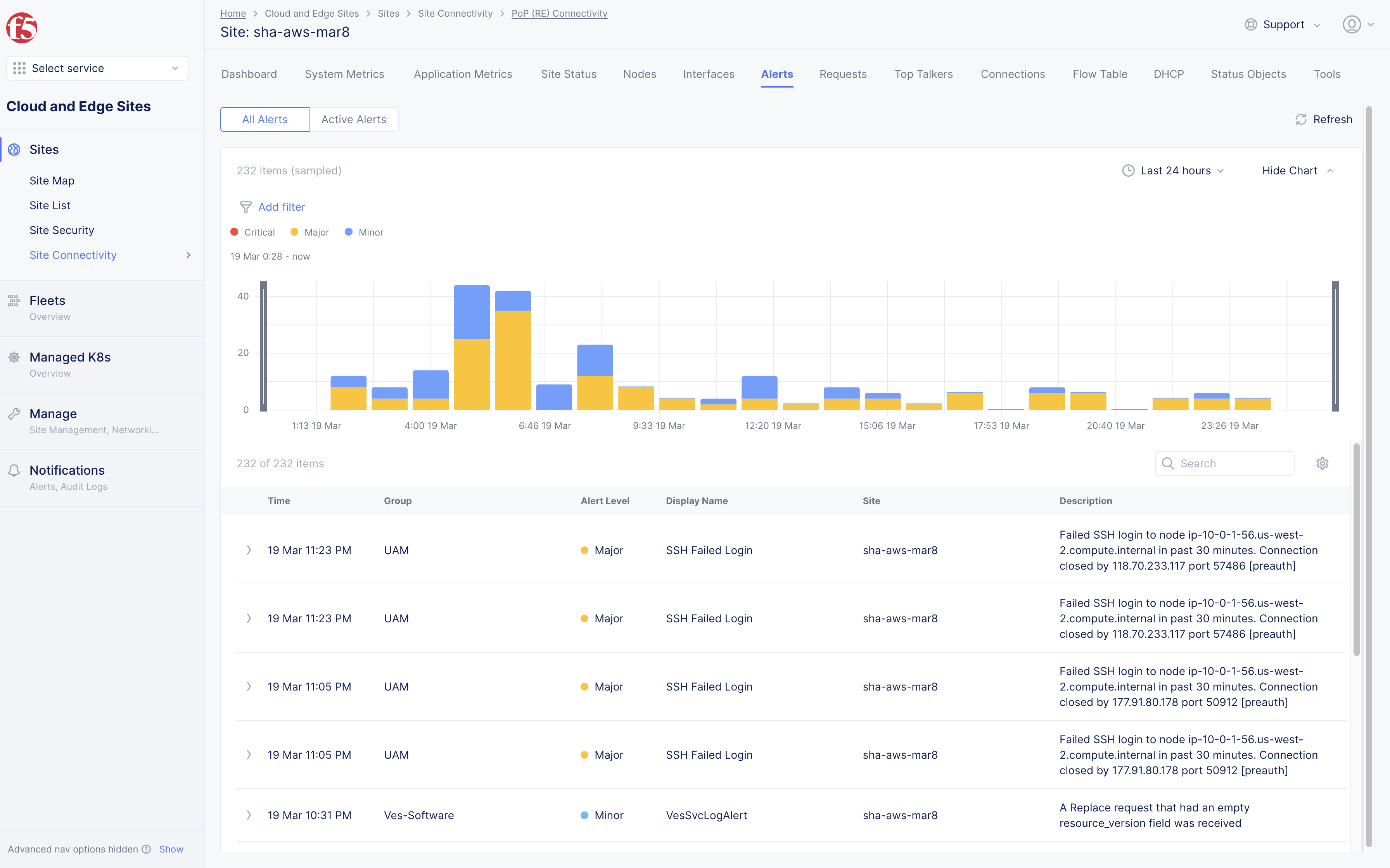
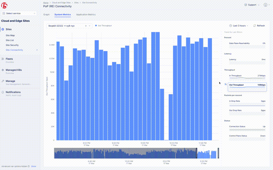
Detail pages
We went over first level entry pages like map, graph, and table/overview page. From there, users can jump to next-level detail pages. This level mostly has tabs on top which allows users to quickly switch to the page that interests them.
The page can have a dashboard, chart, table, or combined, different components. We defined a few patterns with each page getting the optimized one, according to its data type. At this level, users are in full investigation mode e.g., exploring historical data to figure out when exactly a problem occurred. And we provide various interactive features to help them.
More explanation on different components can be found here where I introduce our design system.


Video
Video showcasing Volterra in F5 (main screens show up from 00:45)
Table
Table is a common component used in our product. However, each table required a slightly different top section and columns. For example, some tables had columns with plain text, while others had buttons or tags. (See slideshow below.)
Designers, unaware of these variations, often created new styles to support their use case. To solve this issue, we collected all possible combinations and put them into a Figma component. Now, designers can just toggle on/off types of columns they want.


Dashboard
Dashboard is another heavily used pattern in our monitoring pages. Many dashboards share similar cards, but each of them varies a little. (slideshow below) Again, we did the same exercise of gathering cases for cards.
In Figma, we made it easier to customize each card. For example, your dashboard tile might only have 3 vs. 4 values to display; or your customer might want to add bars next to a map tile. All these variations are captured in Figma. Designers can just choose what they want to display by showing/hiding a layer.


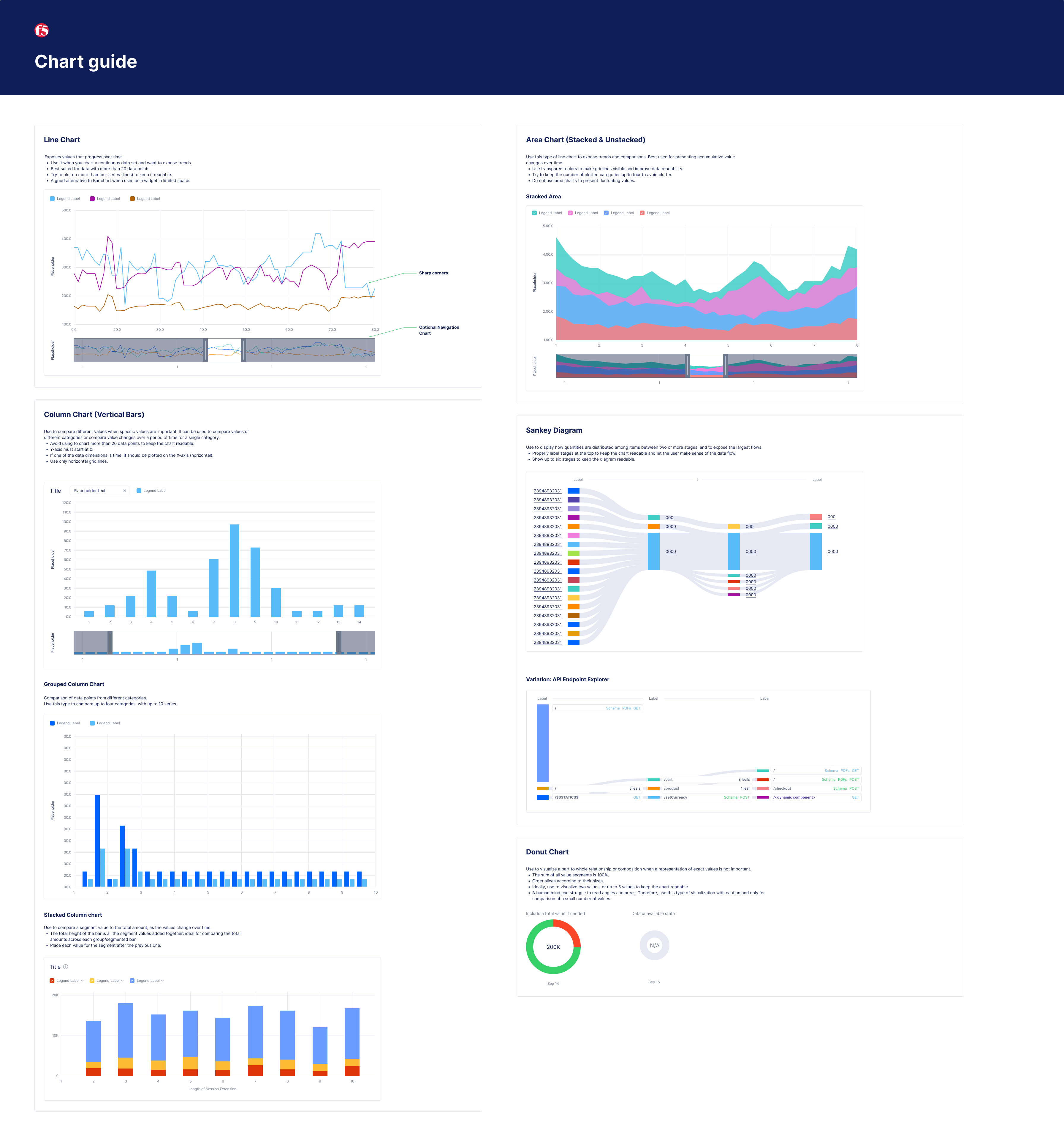
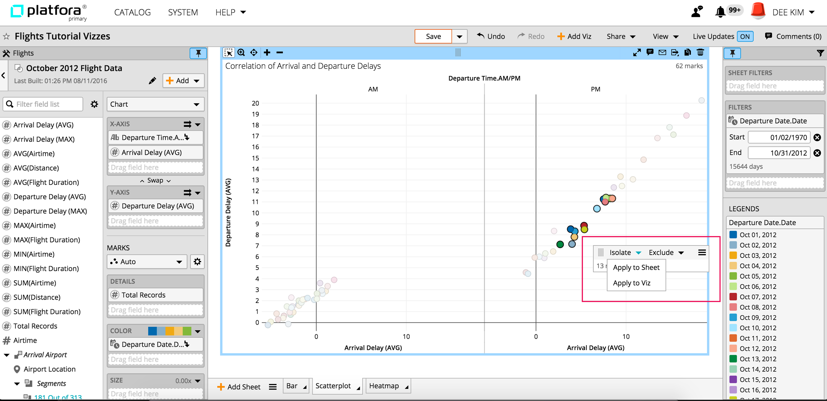
Chart
We can use a chart in dashboard, table page, or occupy the whole page. We support line chart, bar chart, area chart, sankey, donut chart, etc.
Users must pick the right chart that suits the data type. For example, we don't recommend donut chart with more than 3 things to display, which makes it hard to read and compare data.
We not only documented guidance on each chart in the design system, but also created Figma components where designers can adjust the width, color, and the legend.


Tooltip Light
Visualizations (like chart, graph and map) help users detect abnormal activities in a glance by using color, volume, etc. However, they don't provide detailed metrics.
This is when the tooltip comes into place. 'Tooltip Light' is the go-to tooltip in monitoring pages. Metrics like timestamp, count, score, and rate are shown using this tooltip to help provide further information to users.
As you can see below, our tooltip can have a title, sub-title, key-value pairs, and an icon. Since the main component includes all possible options, designers can drag this component to the board and edit combinations. For example, if they only have a timestamp and one metric, they can just enable the title and key-value pair.


Dropzones
After data is prepped, it can be explored in a space called Vizboard. Here users create visualization (charts, graphs, etc) by dragging data fields to drop zones.
However, constraints existed. Some visualization required data fields to be put in a certain area of a dropzone for it to get generated. And this wasn't explained to users.
Our solution here was to create smarter dropzones offering instructive text and highlights that can guide users where to drag data fields to.
I created motion mock-ups and specs to explain this new interaction. We held sessions with dev team to go over the details. Below are few examples.

Filter on/off
Users usually add multiple filters to clean up data in a big data visualization. However, no way existed to switch back to 'no filter' state for comparison. Instead users had to remove applied filters and lose their filter settings.
Our solution? We introduced an on/off toggle button where users can quickly shift left and right to have filters removed from displayed visualization.


Tooltips
Interactive Tooltips were redesigned throughout the product to help users understand key metadata and get familiar with data.


Overview
Flow was a new visualization type allowing users to analyze connections across a number of dimensions – particularly helpful for behavioral analytics.
As you can see in the image, flow was optimized for looking at an event series, an order of actions taken by an entity. Sequencing of events helped answer questions such as 'Which page did users visit before leaving our site?'. To get this visualization, data had to be analyzed on an entity-by-entity basis. (e.g., customer by customer)

A scenario illustrates. Say an analyst was trying to create a flow to see what pages users visited after. Data had to be grouped by customers and ordered by timestamp. Then, the next 2 pages had to be output as columns based on their position. For most analysts, writing an expression language for these steps was a challenge. (See image below).

Solution 1
To assist analysts not comfortable with writing an expression language, we created an event series builder (from 2nd slide) where users could easily define an event series, select a pathing type, and edit the number of stages.


Solution 2
After analysts were done with the data preparation process, they brought these sequential event series fields (e.g., URL, URL+1, URL+2) to Vizboard to visualize as a flow.


Complex field
We also introduced a new field type called a complex field. Without this, users had to drag and drop each field to get a visualization. For one or two stages, a complex field was not necessary. But, with more than ten stages, it became a must.
With the complex field, all sub-fields lived under one parent field. Therefore, when a parent field was selected and dragged, all sub-fields automatically followed.


I changed the whole information architecture and reorganized the layout of many pages to offer a better user experience. Below are some before & after examples.We migrated from Angular to React.
I updated the design system (elements like buttons, messages and other components) to give a more consistent look across all pages.


